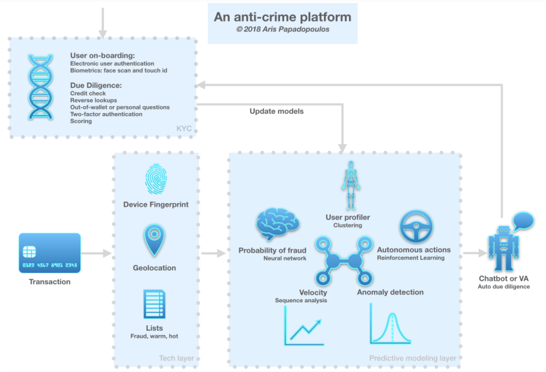
I was given an anonymised dataset of approximately 700,000 card transactions for fraud analysis by a Fintech firm. In this post I am excited to be able to share a report that describes the context, techniques and insights.

Blog
I was given an anonymised dataset of approximately 700,000 card transactions for fraud analysis by a Fintech firm. In this post I am excited to be able to share a report that describes the context, techniques and insights.
Shortly after Kobe Bryant retired a couple of years ago, Kaggle released a dataset containing 20 years worth of his shots. That’s a lot of swish and I am thinking: Basketball and data science… What more can you ask?
So here is an article on how to build a simple classification model to predict if it’s in or rim. I first published it at Towards Data Science on Medium. The aim is to discuss the intuitions and the practices one can leverage end-to-end, step-by-step, from data exploration to model tuning and finally evaluation. Emphasis also on simple. A decision tree (that’s what we are building) will not win you a competition but the process of building a simple model might also be 80% of the whole work in real-world situations.
Time for data action…
I will be using Pandas, Jupyter Notebooks and Scikit-Learn. For the visualisations, I will use Seaborn and Graphiz. I will also briefly use Tableau for fast exploration (it is definitely not necessary though, you can use Python’s tools for the same, I just happened to have it handy and thought I’d try it).
Here’s what follows on a high level: We’ll start by exploring the dataset and visualising it. We’ll clean it and split it to training and testings sets. We’ll model with a decision tree and for this we’ll find the bias/variance sweet spot. We will visualise it and finally evaluate it.
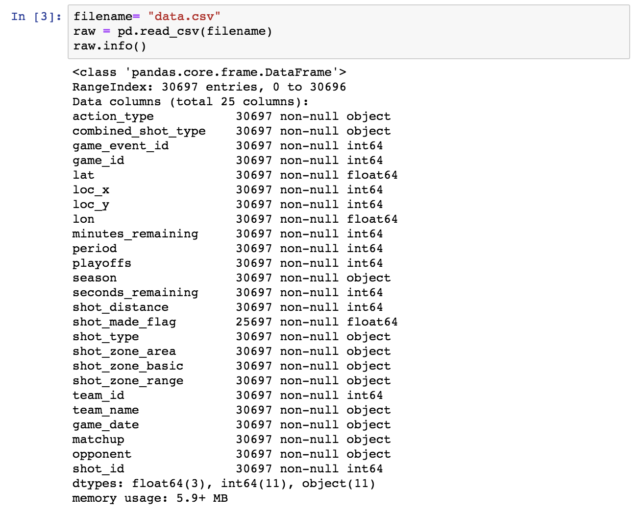
The first step is to explore the dataset at hand. This file is provided by Kaggle: data.csv. We only know that theshot_made_flag field is the target variable: Its value is 1 if Bryant scored that shot and 0 if he failed it. Everything else remains to be investigated.
The necessary imports for facilities that will be used throughout the project:
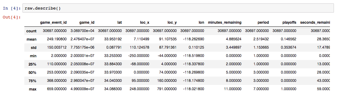
Let’s start the exploration by using the typical Pandas facilities: info() and describe().
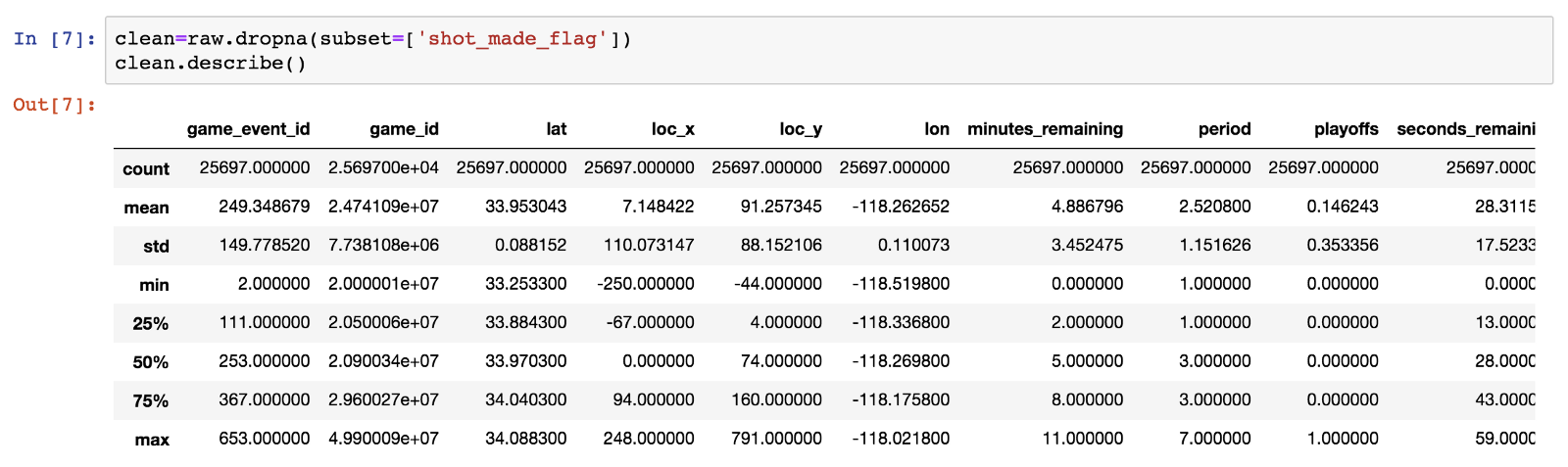
Next, let’s drop the rows in which shot_made_flag has null values, as they are not useful for either training or testing. We will use a new dataframe for the cleansed data.
Of the initial 30697 rows, 25697 remain and 5000 are dropped.

We observe that minutes_remainingtakes values from 0 to 11, so we conclude that this is the time in minutes remaining until the end of each of the four 12-minute periods. Seconds_remaining take values from 0 to 59 as expected.
Let’s combine the two fields to the time_remaining in seconds until the end of each period and add it to the dataframe (see the bottom of the info() list and the row count being 26).

Let’s now have a closer look to check the distinct values of the categorical fields.
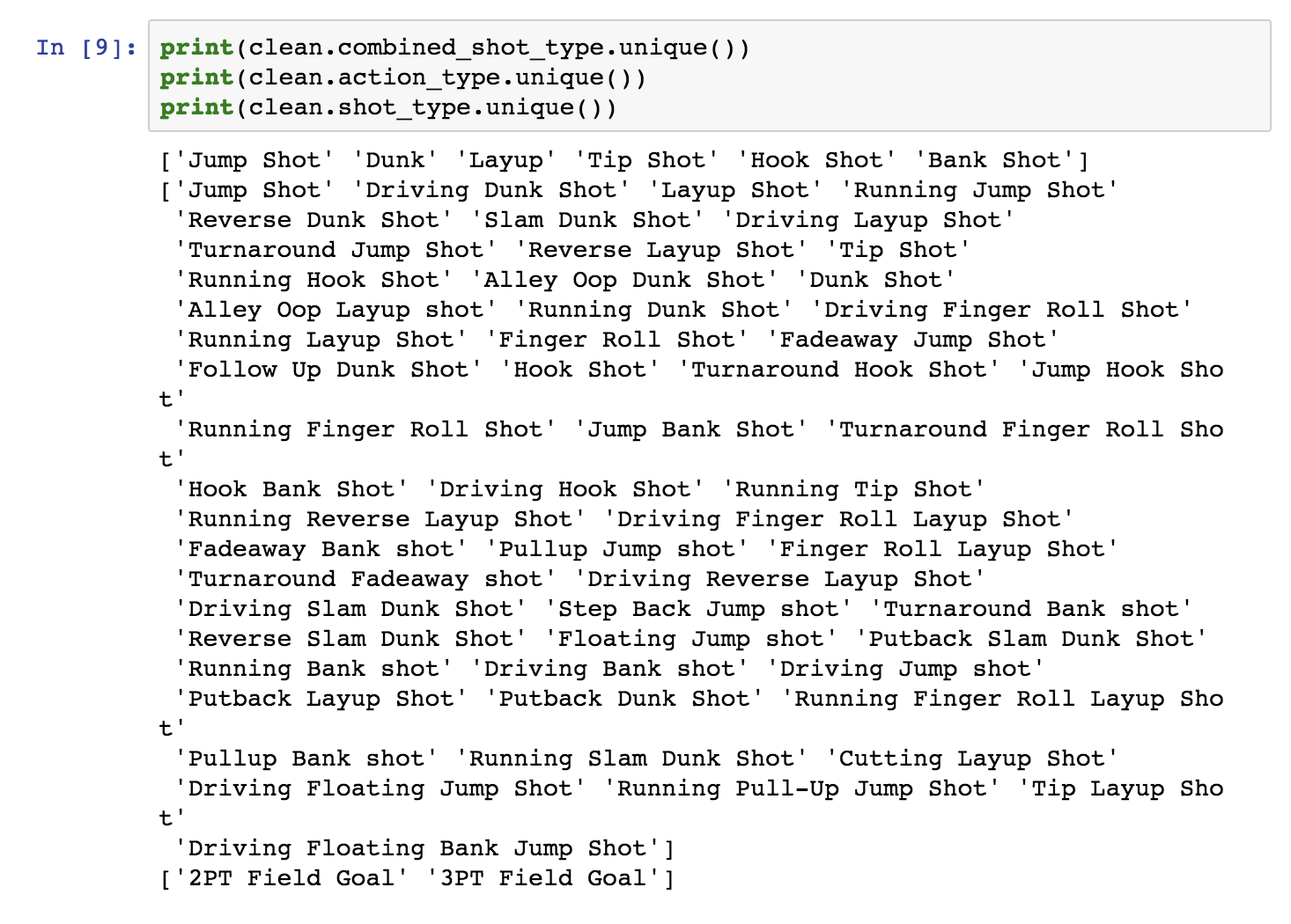
Apparently action_type is a finer-grained categorization of combined_shot_type.
Next, let’s check the court area variables.
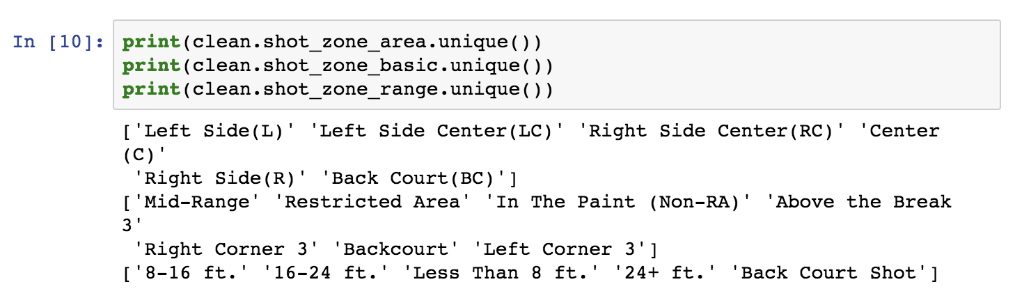
The first two fields are area categorisations, while the last is the distance in “buckets”. We will map these areas of the field in the next section.
Here is where the good fun starts. Visualising the data is probably the most important part. I will use a bunch of Pandas features.
Let’s first check whether the loc_x, loc_y, lon and lat fields signify the coordinates of each shot, as suspected, and if there is a reason we have four parameters instead of just two. For the rest of our analysis, blue color designates a successful shot (shot_made_flag==1), and red color designates an unsuccessful shot.
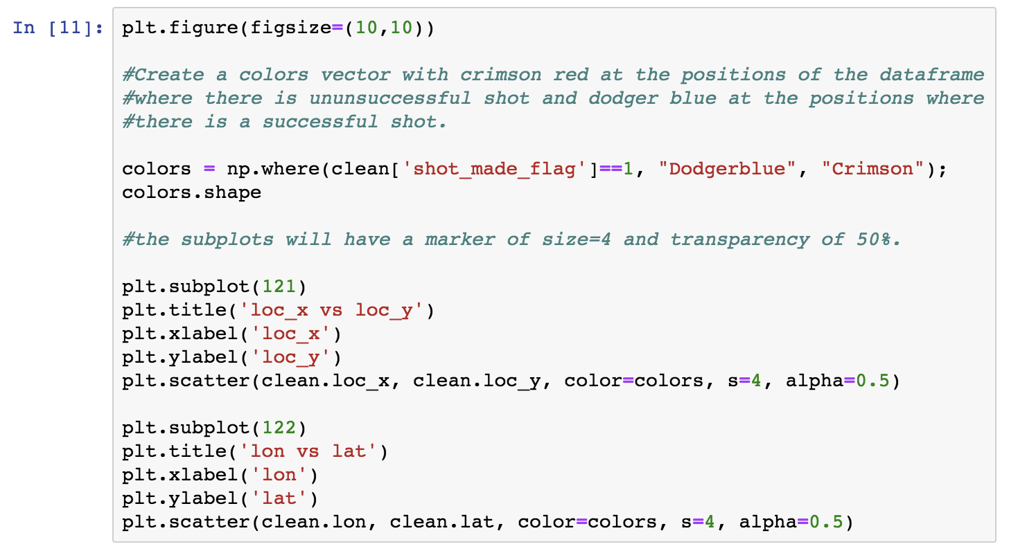

Observe that the two plots look like mirror images. I’ll get back to this later on.
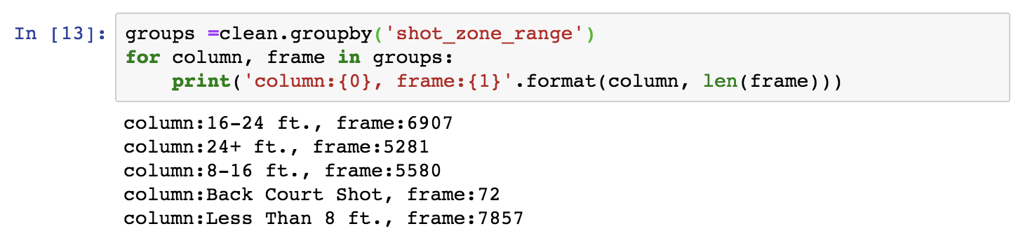
I will next check whether the area-related fields signify different areas of the court, related to the coordinates and I will map them. To this aim I will use the Pandas groupby utility. I will do it step-by-step for clarity. So let’s first deepdive a bit into groupby dataframes and how they can be used, before actually using them for further visualisation. Let’s group by shot_zone_area. We can then iterate on the groupby dataframe by the column we used to group items on and the rest of the dataframe, as shown next. The following block will show us the different values of the column we grouped by, and the length of each corresponding division in the rest of the dataframe.
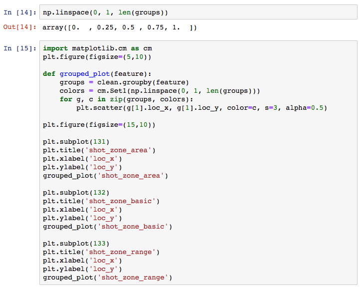
Next, I will define a method that takes any of the area features as an input and groups by the given feature. I will get a Numpylinspace of equally spaced points with length equal to the groups created by the given feature’s groupby. This will be used to pick a color for a colormap for each one of the groups. Finally we will iterate on the groupby dataframe as above, assigning to each group a different color using zip. Note that in the groupby dataframe, we need [1] to access the rest of the dataframe, as [0] is the groupby feature. You can choose from a selection of Matplotlib palettes.
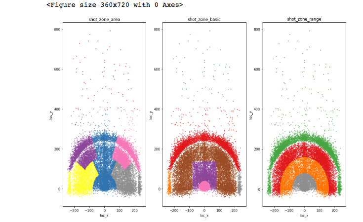
You will find this type of graphs quite frequently in Kaggle’s forums as part of the discussion around a competition.
After familiarising with the basics of the dataset, I will now use Tableau in order to double down on the dataset and make it as transparent as possible. As mentioned before, you can achieve the same results with Python.
Here’s an intuition: Roughly speaking if there is “enough” variation of the target variable’s distribution across “buckets” defined by a feature (i.e. the feature’s different values), this could be an indication that the feature is predictive of the target variable. Let’s discuss this point more…
First, take it with a grain of salt: A relatively even target variable distribution does not necessarily mean that the feature is not predictive. The distribution might be more variable in a subset of the dataset (we are currently examining the entire set). Depending on the modeling algorithm and the subsets it creates in the process, a feature might prove to be predictive. Think about this for a moment.
Conversely, it may happen that a target variable distribution varies across the values of a feature but the feature will not make its way into a good predictive model. When? Simply, if it is dependent or correlated to another feature. In that case, it would possibly just add to overfitting. As an example of dependent features, the area variables are mappings of the coordinates, as we showed earlier in the Jupyter notebook. Strictly speaking the empirical intuition of a “enough variation” can be statistically tested.
Now, let’s examine how shot_made_flag distributes against some of the features. You don’t need to check each feature, I just want to show ways of making the dataset completely transparent and build good intuition. I will return to assess these intuitions in retrospective when I build and evaluate the model later on.
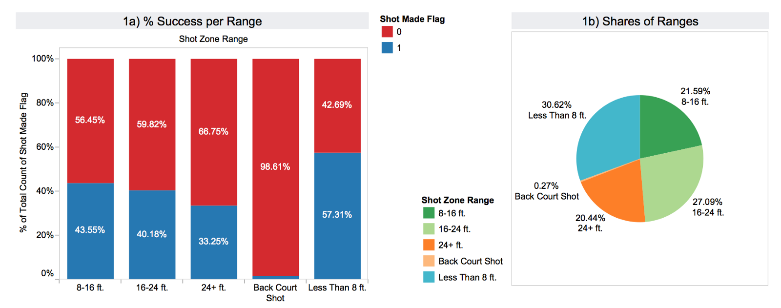
In the next graph you can see theshot_zone_range distribution. The scored shots are represented with blue and the failed attempts red. Apparently, the target variable is unevenly distributed across the subsets defined by the range feature. The pie graph on the right (1b) shows how many shots there are in each bucket in total.
In the second graph, the blue line represents scored shots per shot_distnace. The distance is in feet and one can see the steep increase at the limit of 22–23 ft. where the 3 pointer line lies. The red line shows the number of failed shots. 3a) shows the success ratio for the 2 and 3 pointers. Finally, 3b) is the share of total 2 and 3 pointers attempted (shot_type).

All the above features are correlated, which means that not all will make it to the predictive model. Distance and x/y coordinates are a different representation of the independent variable. The rest are mappings of the distance.
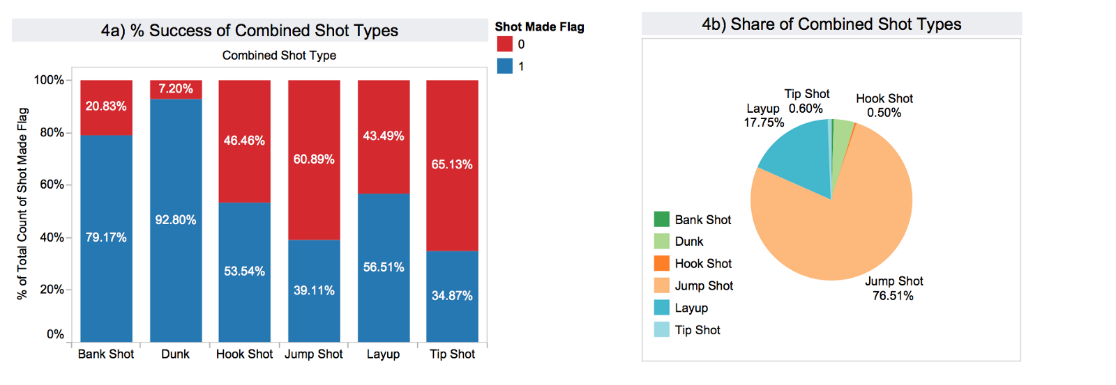
In graph 4) it becomes evident that the target variable is distributed unevenly across the combined_shot_types as well.
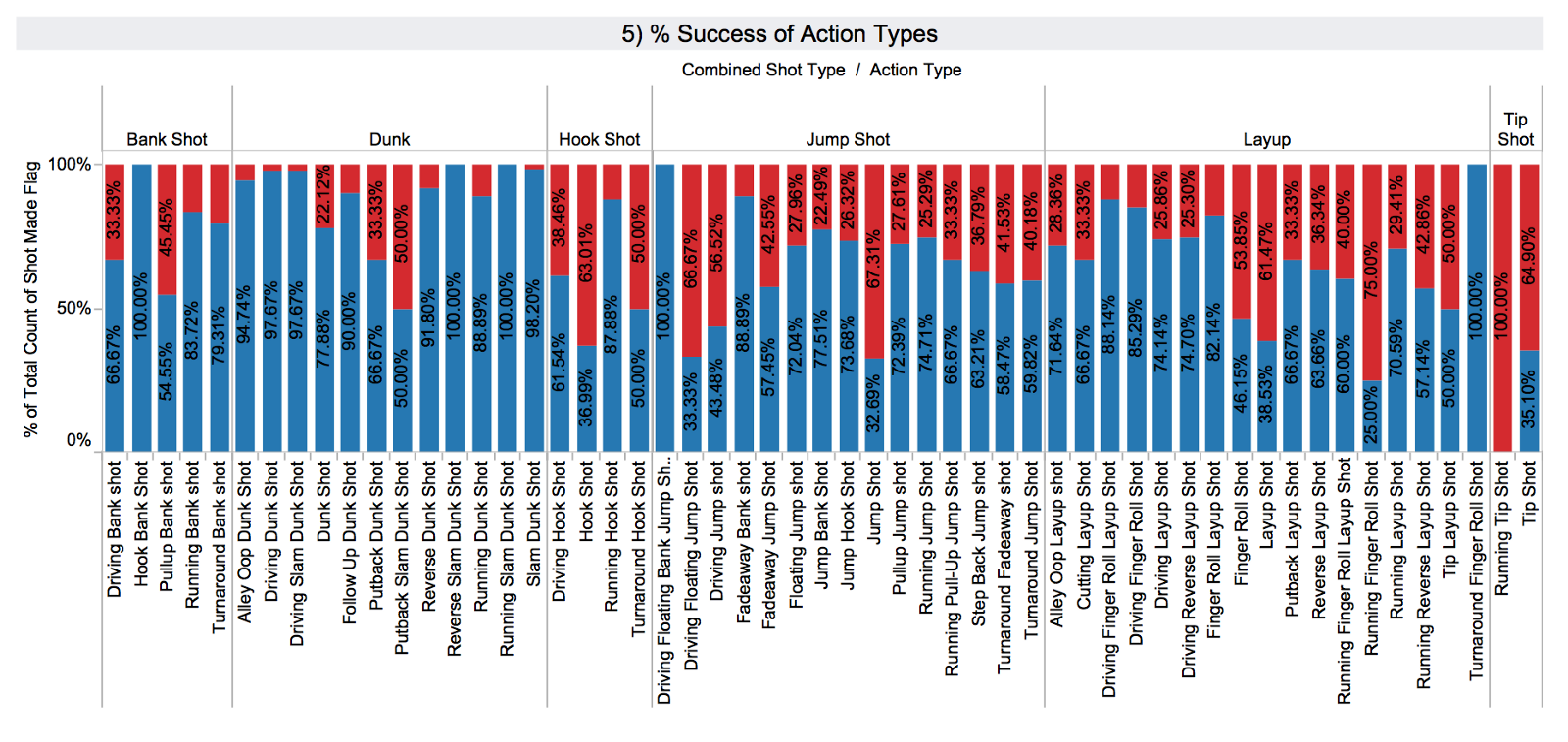
In 5) one can observe that action_type is a more fine grained categorisation of the combined_shot_type. Again there is notable variability, and so I expect that action_type is a good candidate for the predictive model.
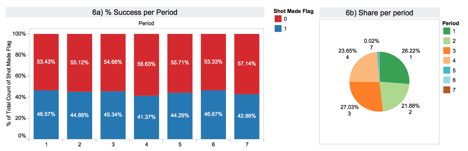
In 6) I have summarised the performance per period of the game and the share of shots in each period. Here we see a more even distribution.
Graph 7) illustrates the calculated field remaining_time until the end of the period.

I think that you get the point already, so I’ll skip visualising the rest of the variables. At this point, we have a full understanding of our dataset.

For the actual modeling part, I will use a decision tree for two reasons:
Decision trees work by splitting the sample space into purer segments. The criterion that we will use for splitting is entropy (although you can also use gini). Entropy is defined as follows:
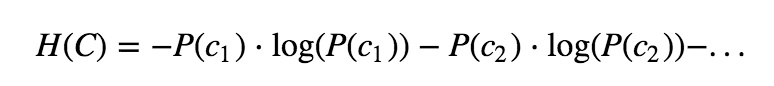
where P(c1) is the probability of class c1 in the segment and so on. In a problem with two classes, a pure segment (having either only class c1 instances or class c2) has entropy 0.
Next, I will show the following in the context of decision trees:
First, let’s drop all lines where the target variable is NaN.

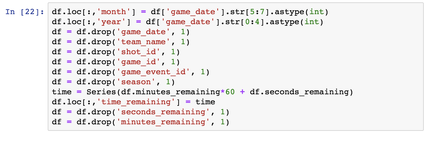
Let’s start by examining the temporal features. They are relevant as follows:
Game_date may capture performance variability based on the point in a season (e.g. month etc).game_date into month and year.Season (and the year component of game_date) may capture the effect of aging in the player’s performance.time_remaining (in seconds) and drop seconds and minutes_remaining.The shot_id and game_id may be useful for time series analysis, but for now we can drop them. Team_name is always L.A. Lakers, so we can drop it as well.
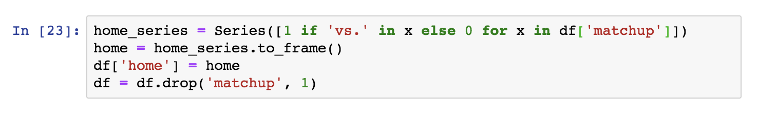
Part of the matchup information is in opponent. However, we want to capture the home/away property. We will create a series with 1s where there is ‘vs.’ in the field (apparently corresponding to home games) and 0s elsewhere (‘@’ apparently corresponding to away games). I will then drop the matchupand append the binary series:
Now, there is a question pending from earlier on: Why do we have loc_x, loc_y and lon, lat in the dataset? Let’s check whether they are redundant, “mirrored” data as we assumed in previous steps. A simple way to do this, is to compute the correlations between the variables loc_x and lon, and loc_y and lat respectively.
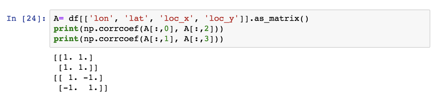
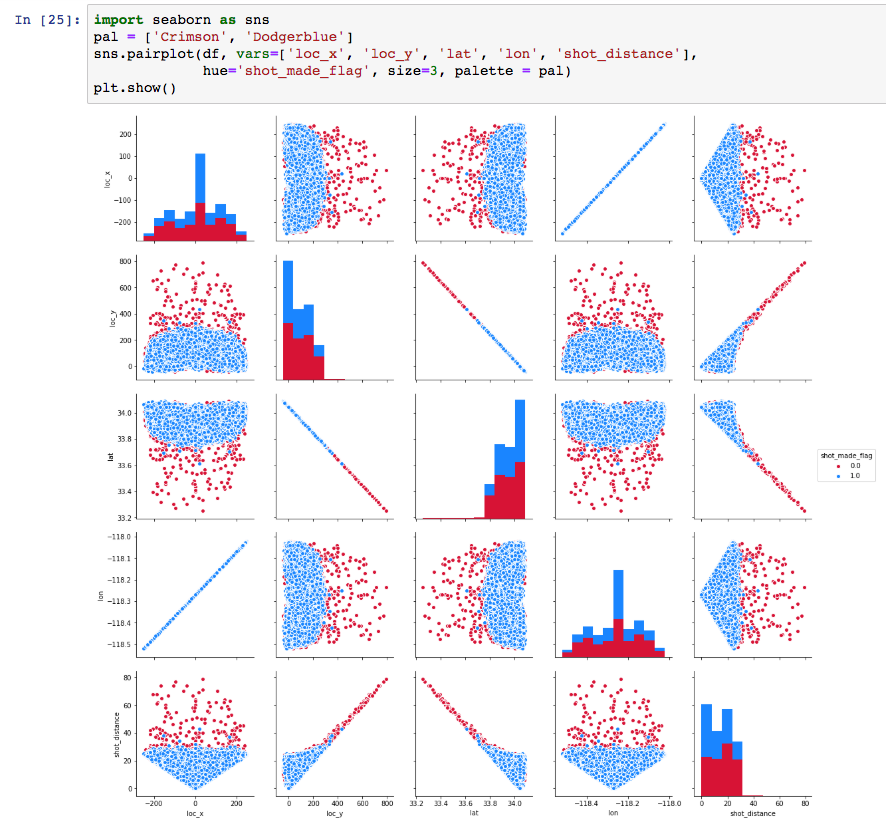
Evidently the variables are pairwise correlated 100% and thus one of the two pairs is redundant. Seaborn provides with a particularly convenient pairwise feature visualisation. We can use it to confirm the above visually.
We will drop lon and lat and check the schema of the dataset before going further.

Good Data Science Note: Strictly speaking, we should only draw these insights by looking into the training set, not the entire set. By looking into the entire set we are slightly “cheating”.
In fact, theshot distance and angle features are sufficient to represent the spatial properties of a shot. The angle feature is captured by one of the two pairs of coordinates; The player may shoot better from certain angles, may be better shooting with one of two hands etc. Of course, retaining the coordinates and the distance features induces redundancy, but entropy based algorithms have an inherent feature selection property.
So let’s now split the dataset.
Good Data Science Note: The pre-processing to be made on the training set will be applied to the test set as well but separately.
I will now isolate the target variable vector from the features and split the dataset to 80% training and 20% test set.
For the purposes of a tree classifier, features standarisation is not required. This is because trees do not work with any notion of distance, rather with class purity. In addition, we chose a tree classifier as our first model because of their interpretability and feature standarisation would compromise the model’s interpretability.
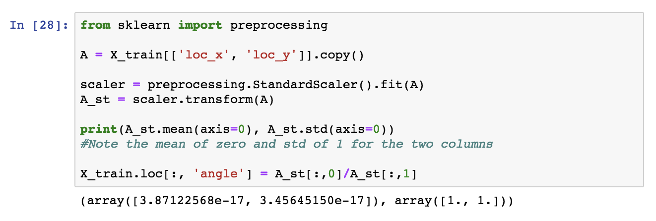
For the purposes of creating an angle feature though we will standarise loc_x and loc_y, to avoid zero values that may result in divisions by zero. With standarisation, the data are re-distributed around a mean of zero in one standard deviation distance.
Good Data Science Note: Once again, this processing must be done in training and testing separately.
Technical Note: Scikit’s
StandardScalerprovides with the facilities to transform training and testing consistently.
Next, we apply the same transformation to the test set, by using the same StandardScalerobject.
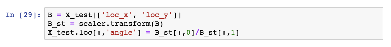
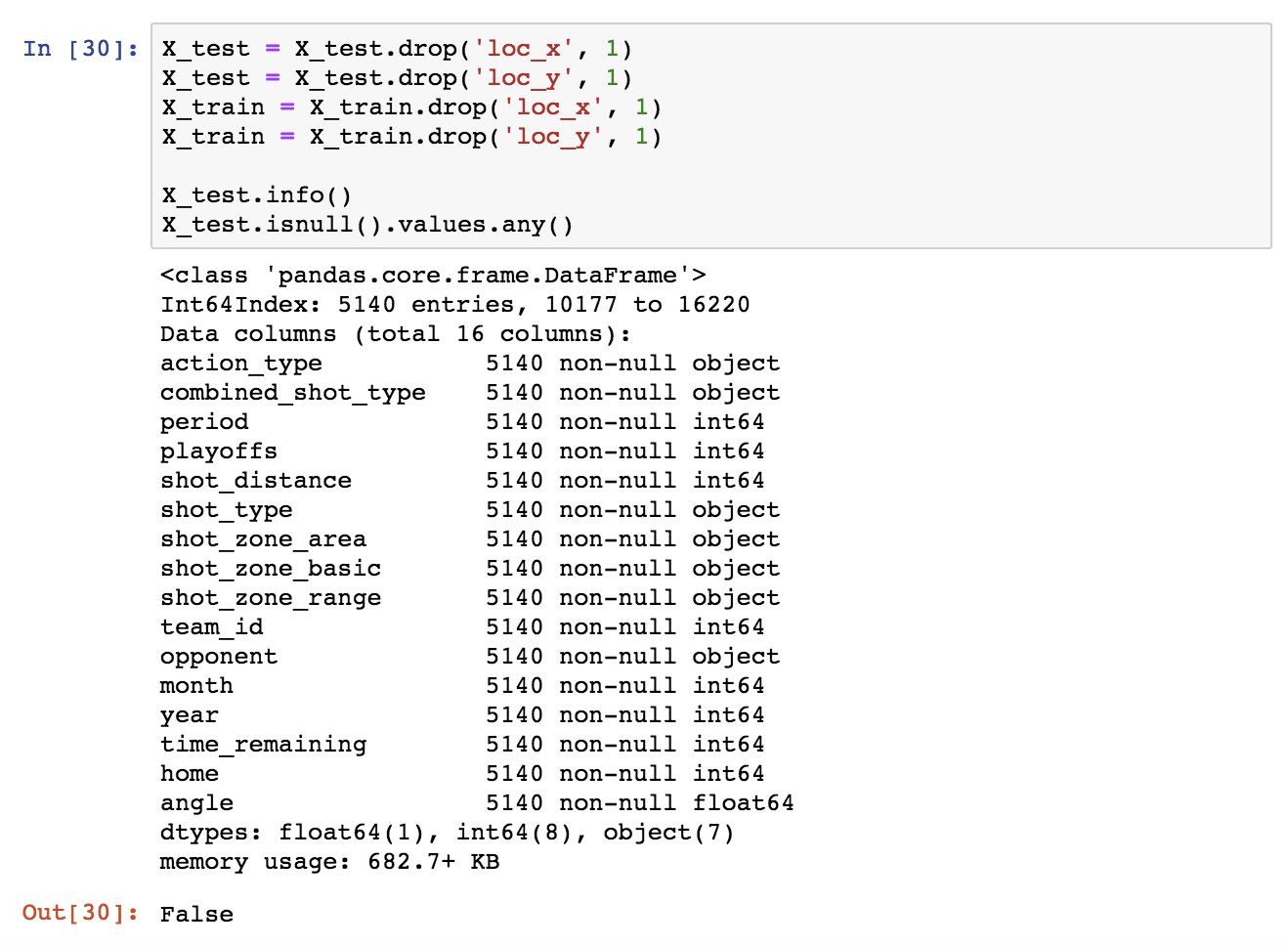
We can now drop loc_x, loc_y from both subsets.

In order to use Scikit’s classifiers, we need to convert the categorical fields. This can be achieved with Pandas’ get_dummies().
Technical note: Alternatively Scikit’s
OneHotEncoderorLabelBinarizercan be used.
Let’s see how the Pandas method works. I will first get the list of all categorical columns (they are of type object). This can be done with select_dtypes().
What is interesting here is that in the general case, as mentioned before, we should not look into the test set at all when pre-processing. Thus:
setdiff1d() we can determine then which dummified columns are missing from the test set compared to the training set and add them with 0 values across all rows.
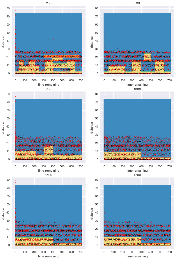
I will now check what is a reasonable complexity for our model. A complex model overfits while a simple model is not predictive, so what is the sweetspot here? I will train tree classifiers of various complexities and visualise their performance on the testing and training set.
To do so, I’ll use the min_samples_leaf parameter of DecisionTreeClassifier which controls the minimum number of samples present at each leaf. The smaller this number is, the more complex is the corresponding model. For decision trees, I’ll use balanced sampling to prevent bias for the dominant class.
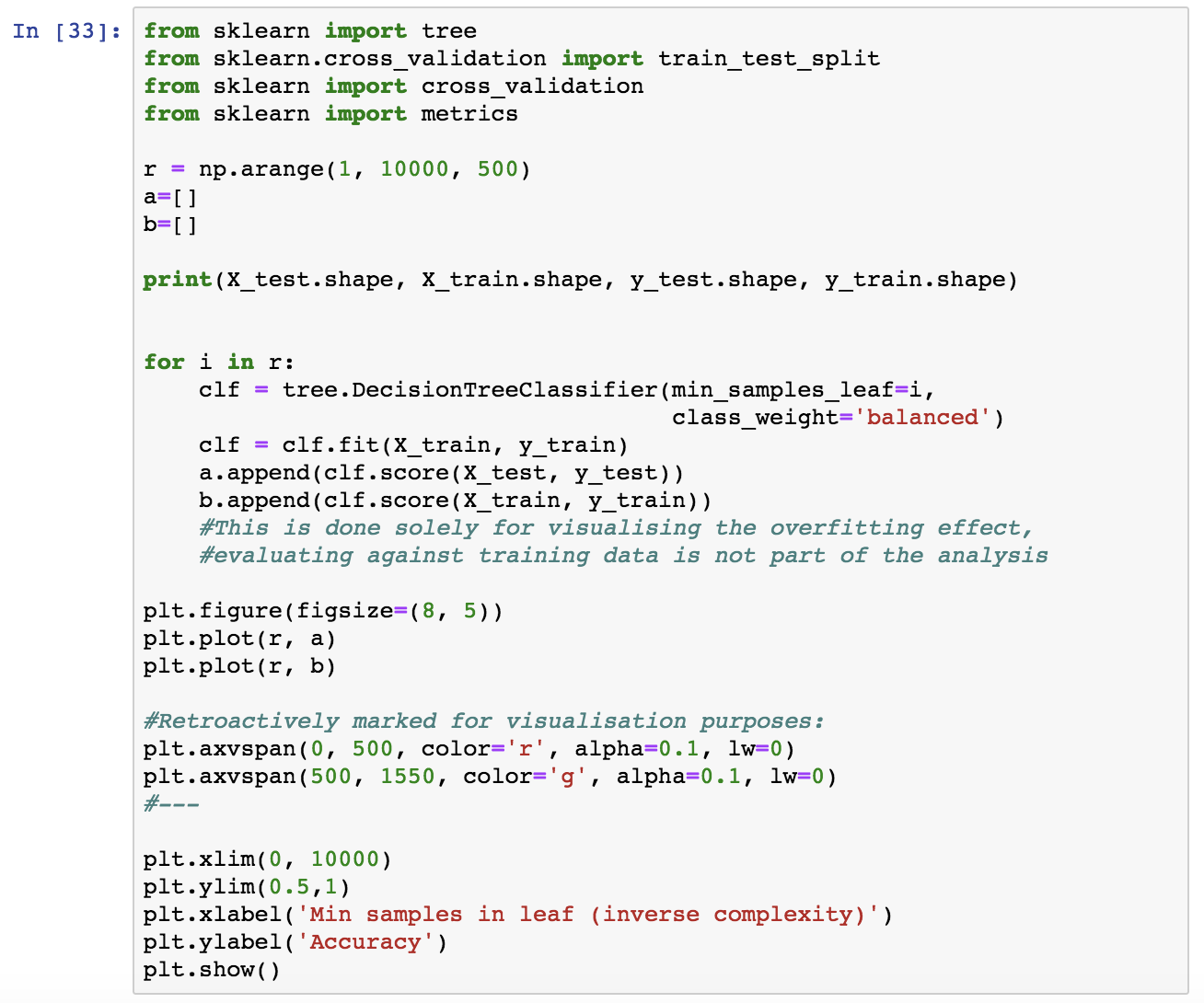
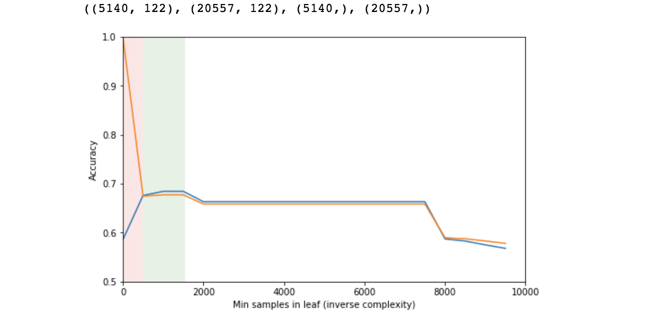
Good Data Science Note: In reality you should never evaluate the performance of a model on training data. Here, it is not part of the “real analysis”, it is only done for demonstrating the effect of overfitting and how accuracy varies vs. the model’s complexity in relation with overfitting. See next.
This is the expected behaviour. This rough process is mostly for instructional purposes, but it also helps narrowing down an area of reasonable complexity, in which we can then perform cross-validation, a more expensive and accurate process, in order to pick an optimal value.

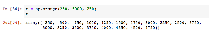
I’ll use 10-fold cross-validation in the area of 250 to 5000 minimum leaf samples value, in order to pick an exact value for use for our model. I’ll get the mean accuracy and variance of each cross-validation run.
I’ll use the f1 score to evaluate the models.
Good Data Science Note: f1 is preferred over accuracy as a model evaluation metric. Accuracy is not informative of false positive and negative rates which may not worth equal for particular applications and it may be misleading in case of very unbalanced classes (not the case here).
Technical Note: If despite that, you would like to use accuracy, declare it so in the
scoringparameter ofcross_val_score. Scikit learn provides with an array of alternative metrics.
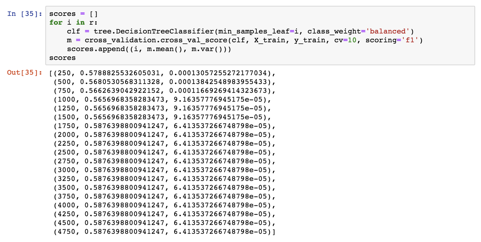
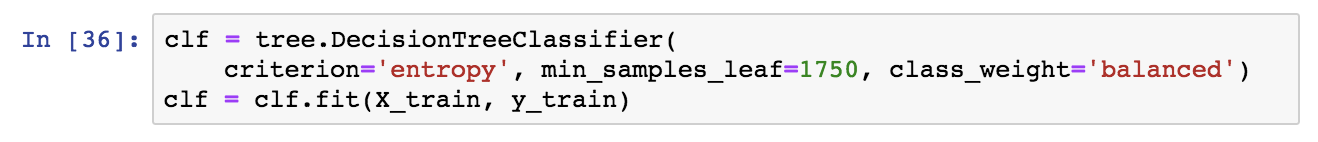
The minimum number of 1750 samples maximises accuracy and f1. I will now train a decision tree with this value. Once more, sampling should be balanced, and the criterion will be the entropy.
I will now visualise our decision tree model. In the following graph, blue signifies scored shot prediction and orange represents a missed shot prediction. Lower entropy (corresponding to higher purity) is represented with darker colors.

Note that the tree is rooted at action type (jump shot). If you scroll back up to Tableau graphs 4 and 5), you will notice that we were expecting this feature to make it into the predictive model because the target variable varied quite a lot depending on it.
Also, note that jump_shot is the dominant type of action. These two combined mean that it creates divisions that maximise purity, so it is natural to be the first predictive feature that the model picks up. Single-feature trees (aka decision stumps) are often used as baseline classifiers, action_type_jump shot would be the feature for a stump.
For similar reasons, shot distance and season (year here) were also expected to make it high in the model. On the other hand, time remaining was not an apparent predictive feature.
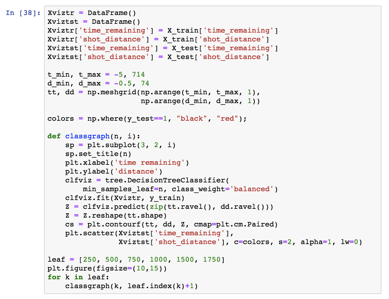
It is interesting to see how the tree divides the feature space. A typical visualisation is pairwise feature comparison. In this case, we have many categorical and binary features and that does not help visualising, so I am just picking two significant numerical features, time_remaining and shot_distance and comparing how the model complexity affects the areas that the tree creates.
For visualisation purposes:
Let’s calculate the tree’s accuracy:
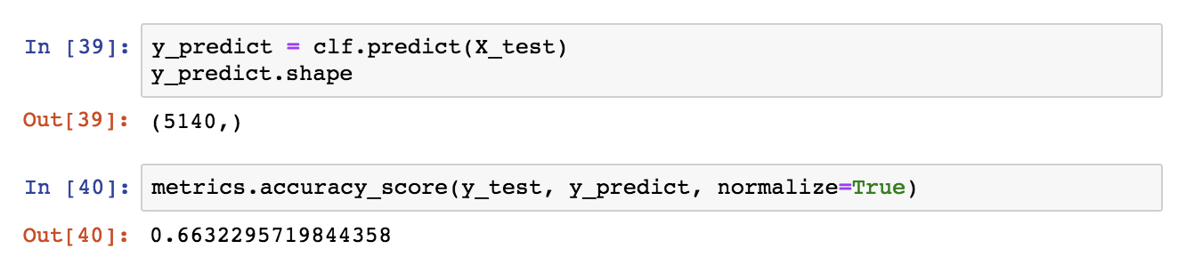
Does this accuracy score beat the baseline majority classifier (a “classifier” that always predicts the dominant class), and if so by how much?
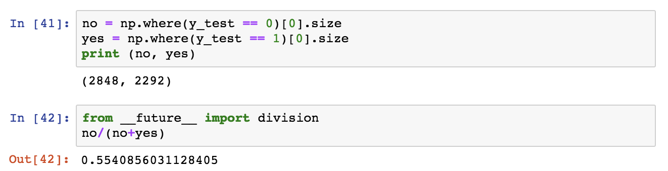
So, the decision tree is predictive with an accuracy ~0.66, a significant improvement over the baseline majority classifier which has an accuracy of 0.55. Let’s inspect the confusion matrix as well as the precision, recall and f1 score.
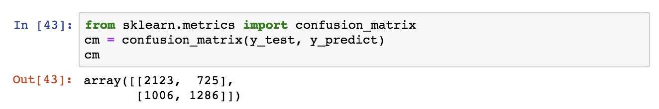
The y-axis is the real class, the x-axis is the predicted class and classes appear in ranked order (so 0, 1). According to this, we get a high number of false negatives (1006). For transparency, we can plot the confusion matrix.
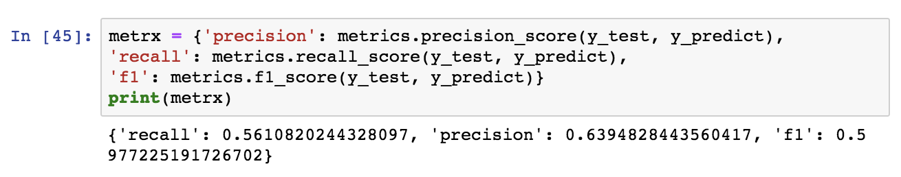
Now let’s examine the precision, recall and f1 score:
If you made it all the way here, thank you for reading and I hope that you found it both useful and enjoyable.

I recently started writing what I hope that one day may become a short Popular Science guide on Artificial Intelligence. The idea is to try and describe the most important technical insights of the state-of-the-art commercialised technology (e.g. Convolutional and Generative Neural Nets, Deep Learning etc.) in an approachable way and through an applications and product perspective. At the same time, to try and tell the story of if and how the current technology may lead to an intelligence revolution, as well as what is meant by this term and what the implications could be.
Click at the picture below to read a draft of the first chapter. Certain parts are omitted.
 Photo by Greg Rakozy
I originally wrote this piece as a response to a question on Quora, which proved the most popular response of that thread and was featured in a Quora top picks email digest, so I decided to re-blog it here. Link to my original response on Quora.
An artificial neural network (NN for short) is a classifier. In supervised machine learning, classification is one of the most prominent problems. The aim is to assort objects into classes that are defined a priori (terminology not to be confused with Object Oriented programming). Classification has a broad domain of applications, for example:
The term “supervised” refers to the fact that the algorithm is previously trained with “tagged” examples for each category (i.e. examples whose classes are made known to the NN) so that it learns to classify new, unseen ones in the future. We will see how training a NN works in a bit.
In simple terms, a classifier accepts a number of inputs, which are called features and collectively describe an item to be classified (be it a picture, text, transaction or anything else as discussed previously), and outputs the class it believes the item belongs to. For example, in an image recognition task, the features may be the array of pixels and their colors. In an NLP problem, the features are the words in a text. In finance several properties of each transaction such as the daytime, cardholder’s name, the billing and shipping addresses, the amount etc.
It is important to understand that we assume an underlying real relationship between the characteristics of an item and the class it belongs to. The goal of running a NN is: Given a number of examples, try and come up with a function that resembles this real relationship (Of course, you’ll say: you are geeks, you are better with functions than relationships!) This function is called the predictive model or just the model because it is a practical, simplified version of how items with certain features belong to certain classes in the real world. Get comfy with using the word “function” as it comes up quite often, it is a useful abstraction for the rest of the conversation (no maths involved). You might be interested to know that a big part of the work that Data Scientists do (the dudes that work on such problems) is to figure out exactly which are the features that better describe the entities of the problem at hand, which is similar to saying which characteristics seem to distinguish items of one class from those of another. This process is called feature selection.
A NN is a structure used for classification. It consists of several components interconnected and organized in layers. These components are called artificial neurons (ANs) but we often refer to them as units. Each unit is itself a classifier, only a simpler one whose ability to classify is limited when used for complex problems. It turns out that we can completely overcome the limitations of simple classifiers by interconnecting a number of them to form powerful NNs. Think of it as an example of the principle Unite and Lead.

This structure of a combination of inputs that go through the artificial neuron resembles the functionality of a physical neuron in the brain, thus the name. In the following picture the structure of a physical and an artificial neuron are compared. The AN is shown as two nodes to illustrate its internals: An AN combines the inputs and then applies what is called the activation function (depicted as an S-curve), but it is usually represented as one node, as above.

Moreover, in the brain neurons are connected in networks as well via synapses to the dendrites of neighbouring neurons.

The analogy goes deeper as neurons are known to provide human brain with a “generic learning algorithm”: By re-wiring various types of sensory data to a brain region, the same region can learn to recognize different types of input. E.g. the brain region responsible for the sense of taste can learn to distinguish touching sense input after the appropriate sensory re-wiring. This has been confirmed experimentally on ferrets.
Similarly ANs organized in NNs provide a generic algorithm in principle capable of learning to distinguish any classes. So, going back to the example applications in the beginning of this answer, you can use the same NN principles to classify pictures, texts or transactions. For a better understanding, read on.
However, no matter how deep the analogies feel and how beautiful they are, bear in mind that NNs are just a bio-inspired algorithm. They don’t really model the brain, the functioning of which is extremely complicated and, to a high degree, unknown.
At this point you must be wondering what on earth is an activation function. In order to understand this we need to recall what a NN tries to compute: An output function (the model) that takes an example described by its features as an input and outputs the likelihood that the example falls into each one of the classes. What the activation function does is to take as an input the sum of these feature values and transform it to a form that can be used as a component of the output function. When multiple such components from all the ANs of the network are combined, the goal output function is constructed.
Historically the S-curve (aka the sigmoid function) has been used as the activation function in NNs, in which case we are talking about Logistic Regression units (although better functions are now known). This choice relates to yet another biologically inspired analogy. Before explaining it, let’s see first how it looks (think of it as what happens when you can’t get the temperature in the shower right: first it’s too cold despite larger adjustment attempts and then it quickly turns too hot with smaller adjustment attempts):

Now the bio analogy: brain neurons activate more frequently as their electric input stimulae increases. The relationship of the activation frequency as a result of the input voltage is an S-curve. However the S-curve is more pervasive in nature than just that, it is the curve of all kinds of phase transitions.
As mentioned, a NN is organized in layers of interconnected units (in the following picture layers are depicted with different colors).

Training is often done with the Back Propagation algorithm. During BackProp, the NN is fed with examples of all classes. As mentioned, the training examples are said to be “tagged”, meaning that the NN is given both the example (as described by its features) and the class it really belongs to. Given many such training examples, the NN constructs, during training, what we know by now as the model, i.e. a probabilistic mapping of certain features (input) to classes (output). The model is reflected on the weighs of the units connectors (see previous figure); BackProp’s job is to compute these weighs. Based on the constructed model, the NN will classify new untagged examples (i.e. instances that it has not seen during training), aka it will predict the probability of a new example belonging to each class. Therefore there are fundamentally two distinct phases:
NNs with multiple layers of perceptrons are powerful classifiers (deep neural networks) in that we can use them to model very complex, non-linear classification patterns of instances that may be described by potentially several thousands of features. Depending on the application, such patterns may or may not be detectable by humans (e.g. the human brain is very good in image recognition but is not effective in tasks such as making predictions by generalizing historical data in complex, dynamic contexts).
Here is an interactive tutorial I put together on algorithms and data structures in Python, please find it on my Github repo algorithms-and-data-structures:
Contents:
➊ Lists:
○ Array Lists
○ Linked Lists
○ Lists Practice
➋ Queues
➌ Stacks
➍ Hash Tables
➎ Recursion
➏ Sorting:
○ Basic: Selection Sort, Insertion Sort
○ Advanced: Quick Sort, Merge Sort
➐ Trees:
○ Trees Overview
○ Binary Search Trees
➑ Heaps
➒ Graphs:
○ Graphs Overview
○ Breadth First Search, Depth First Search
1. “Beginning Algorithms” by S. Harris, J. Ross – Wrox
2. “Introduction to Algorithms” by T. H. Cormen, C. E. Leiserson, R. L. Rivest and C. Stein – MIT Press
3. “The Algorithm Deisgn Manual” by S. S. Skiena – Springer
4. “Cracking the Coding Interview” by G. Laakmann McDowell – CareerCup
